In what ways does your media product use, develop or challenge forms and conventions of real media texts?
Youtube had a big part to play in the development of our film trailer. In addition gave the us great insight into tackling the conventions from various horror trailers and also looked into which ways ours could noticeably change some conventions. While researching, we found out that they were prominent conventions through trailers, such as females being the vulnerable or victim this was in some occasions twisted and the females were the antagonist. Other conventions were screaming or screeching that was used to create an ominous or shocking trailer and could be used contrapuntally in somewhat serene scenes. Moreover shots that were made in the evening could created a more fitting scene and made the audience more interested in the trailer and this is why we chose to use a color corrector to add a more creepy setting. In addition concealed antagonists were a prominent stereotype and added a sinister or threatening atmosphere. The idea of a concealed antagonists or anti hero adds another element of mystery or we also found in some cases, duplicity. We wanted to not simply just copy other trailers but rather take the best parts from different trailers and modify and evolve to try and make them better and more fitting effective as a horror trailer. This was done in various ways, by creating montages which are coherent with the music and picks up tempo with the shots and cuts. This technique when done well creates a fast paced, lasting effect and leads the audience to ask questions.
The text of the poster had to be effective but yet not over the message of the poster and seem related to our poster and yet realistic. Rather than relying on different sources of media such as newspapers for reviews which were usually related to horror films which lacked narrative and were not actually scary. We used a biblical reference “You Reap...What You...Sow...” The first two words refer to the mask of the antagonist as he can me identified as the grim reaper however the ‘What You’ refers to the audience who is reading the poster as it is centralized it appears personal and has a strong clear message and lastly the word ‘Sow...’ has bigger text than the other two subtitles which relates to the climax of the film. Moreover the ellipsis adds the effect of continuity or that the story is just beginning, we believed that this again was emphasized by the release date being ‘Coming Soon’ which again adds the element of mystery which is a convention of horror films. We had to focus on having a way in which the title stands our and yet link to the tag line, this was ‘Red Dead Retribution’ the extension of some letters implied an image of knives, axes or a demonic connotation of horns. The color of the word ‘Dead’ is red and links to the tag line also the words ‘Red Dead’ are denotations of murder and link to the color red. Moreover the fade of the title has connotations with ghosts and the supernatural another convention in which the team thought it would be vital to indicate. Lastly the studio was not large enough to have a substantial amount of the poster, yet we focused on it looking as professional and realistic as possible. We were ordered by the BBFC give the film an 18 rating and also due to our questionnaire results.
The text of the poster had to be effective but yet not over the message of the poster and seem related to our poster and yet realistic. Rather than relying on different sources of media such as newspapers for reviews which were usually related to horror films which lacked narrative and were not actually scary. We used a biblical reference “You Reap...What You...Sow...” The first two words refer to the mask of the antagonist as he can me identified as the grim reaper however the ‘What You’ refers to the audience who is reading the poster as it is centralized it appears personal and has a strong clear message and lastly the word ‘Sow...’ has bigger text than the other two subtitles which relates to the climax of the film. Moreover the ellipsis adds the effect of continuity or that the story is just beginning, we believed that this again was emphasized by the release date being ‘Coming Soon’ which again adds the element of mystery which is a convention of horror films. We had to focus on having a way in which the title stands our and yet link to the tag line, this was ‘Red Dead Retribution’ the extension of some letters implied an image of knives, axes or a demonic connotation of horns. The color of the word ‘Dead’ is red and links to the tag line also the words ‘Red Dead’ are denotations of murder and link to the color red. Moreover the fade of the title has connotations with ghosts and the supernatural another convention in which the team thought it would be vital to indicate. Lastly the studio was not large enough to have a substantial amount of the poster, yet we focused on it looking as professional and realistic as possible. We were ordered by the BBFC give the film an 18 rating and also due to our questionnaire results.
Our magazine front cover utilizes and develops which were seen in real media texts. From researching real film posters and using our questionnaire asking ‘Which film magazine is your favorite’ 70% of our respondents said that Empire was their most preferable magazine and we focused on a magazine cover which was similar to their layout. This meant using fonts and titles which we would seem realistic and professional and also convey within the horror genre. We incorporated ‘Empire’ magazines use of an attention grabbing title which made it stand out, this technique also had to use a title which would convey a horror genre so we went with ‘Watch’ this seems like someone is watching the audience yet it is ironic as the audience is watching the magazine. It was important that the name stand out and we felt that the name ‘Watch’ had an impact which stayed with the reader. In addition the sub title ‘Hollywood’s Finest’ adds some prestige to our magazine. We chose the color black/chrome makes the title seem solid and direct whereas a more colorful title would have subverted the idea of a horror and also the subtitles color of red was used to create a sense of danger and a link with the title ‘Red Dead Retribution’. Other minor layout options was the inclusion of a barcode, issue number, date and the website all add to the authenticity, we felt this added another element of professionalism away from the text, font and color scheme. Lastly we put a white border around the title ‘Watch’ we felt that this emphasized the title in contrast of the black background.
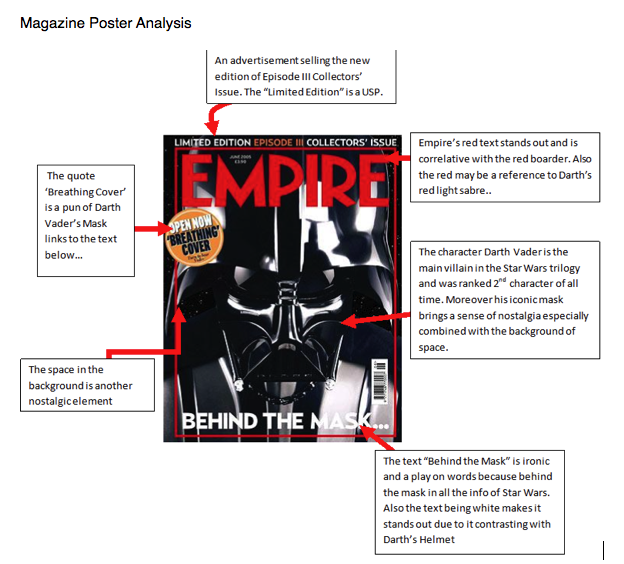
We used a large font on the sub heading ‘Red Dead Retribution’ because we felt that it was vital to let the world know the name of the film before the actors, cast or reviews. We also saw that small studios tried to sell the film before anything else is mentioned, due to most of our cast having little to no recognition in the public eye. Moreover exclaiming that the film was a ‘World Premiere’ highlights that the magazine ‘Watch’ has exclusive coverage of the film and we wanted the audience and all the readers of the magazine to know this. We felt that the positioning of the antagonist had to convey to a horror genre, we felt that this came across with the way he looks into the readers eyes also him holding a picture holds so link to the trailer and creates the element of mystery. In addition the sub title at the bottom saying ‘See Behind The Mask...’ creates mystery, moreover we particularly used this line because it is a reference to the magazine ‘Empire’s most popular magazine edition, which was about Darth Vader. We felt the connections which are held between the trailer and the magazine cover made the tri fecta more appealing as a whole. The convention of the mask was added because it was added a concealed hero and linked to the tag line ‘See Behind The Mask...’ adds some equilibrium to what the link behind the picture of the boy and the man with the mask is. In advertising the film we felt that it was important to make the magazine cover have a theme which was ‘Horror Month’ we felt that this added to the convention of horror and made our film more appealing to a horror audience, we felt that ‘Horror Month’ was important because it was the 666 issue and this number has demonic connotations. Using other films in our magazine cover added to the professionalism and authenticity also mentioning other directors of other films and as they all link to horror again adds to the ‘Horror Month’ The color scheme of the magazine cover is majority red and black, we felt that this added to basic colors which are already connected with the horror genre. White was used to emphasize titles of sub headings and make them more attention grabbing. Lastly the addition of a poster of the film made the magazine cover seem professional and also made it clear that ‘Watch’ had exclusive content.
How effective is the combination of your main product and ancillary task?
How effective is the combination of your main product and ancillary task?
We tried our hardest to make the combination of our ancillary task and main task extremely effective. We spent hours discussing different ways they could link but yet have a distinctive individuality to each of them. We felt that the title of the film gave an insight into the films narrative but yet added an element of mystery; with a cold and shocking rhyme which is quite ironic due to the horrific nature of the film. Yet the font of the title of the poster has an extended sans which we felt looked like devil horns and linked to the demonic main image of our antagonists. We also put negative shots in the background of the poster and although they were not in the trailer create a chilling sense due to the color correction. These pictures were also used to create a shock and catch attention with quite disturbing images such as the girl being gagged which induces claustrophobia and also the iconic hand which connotes struggle or suffer. We felt that both the trailer and poster worked well with each and we believed it boost sales and attention because the poster adds from the trailer as it adds onto the development of the concealed antagonists. We felt that the biblical reference saying “You reap.. what you... sow..” this we felt gave a distinct view of the narrative and was common with an audience and also the fact it was a biblical reference made it link to a more meta physical genre. We created our magazine cover to link with the poster which is why there is a free poster of the film inside because we felt the poster and magazine had links through color, contrast and also layout (in the aspect of where the antagonists is placed). The antagonists is placed in the middle by the magazine to offer a ghostly presence, this is why there is an ominous light behind him to link to a more super natural similar to that of the poster.. We felt that this would create an eerie feel to the magazine cover. Moreover the Watch Horror Month creates a buzz for the film and indication into what genre the film is moreover being advertised with films such as ‘Splice’ and ‘Triple 6’ will encourage people to watch our film due to the overwhelming coverage and its reviews. Lastly the tag line ‘See Behind The Mask’ added to the mystery of our narrative and giving away too much of the story could be detrimental in our advertising efforts.
What have you learned from your audience feedback?
We used questionnaires at the beginning of our planning process to see which direction we may take the film into. Although all feedback is needed we felt this the most vital because it set out our target audience, popular genres and other variables that would attract an audience to our film. We made the questionnaire range from 15 - 38 which we believe was a reasonable and justifiable range to fairly judge our trailer also we made the gender 50-50 and taking a sample of 10 results from our whole results. Receiving results from a large range of ages and a proportionate gender response would result in us to have an understanding of a film that would appeal to most people.
We developed our idea further by to look into which genre appeals to the masses, with the findings it was obvious that a supernatural genre was the favorite and which is why we chose to use this within our narrative. In developing our narrative we chose to look at which part of a trailer appeals to an audience more and the story stood out , this led to a brain storm of ideas which catered different variables such as casting, scenery and music but yet showed a strong and developed story.
Subsequently the questionnaire asked which information the audience would like to see in a trailer and the results were quite similar except the inclusion of directors, this led us to stay away from including the directors name in the inter-titles. Though we knew we could not advertise our name actors we focused on the overview and to have a strong synopsis this allowed use to focus on the release date which we left a mystery by saying ‘Coming Soon’. We felt that leaving mystery added to the narrative and was beneficial in how we sold the film.
Music was an overwhelming important part of our development we received 90% of results which believe music was a strong part of any trailer, this led us to look into which music would be more powerful and would get a stronger, more positive response. This is where Youtube became pivotal in the development of our movie because we researched different kinds of music and focused on finding out which instrument would be more convention to a horror genre.
However the decision of a voice over was undecided by the questionnaire and left us in a predicament to choose by ourselves. Subsequently due to research we found out that voice overs were rare in a horror film trailer and spoiled the sense of abandonment that we were trying to convey so we opted not to use a voice over.
When we chose our trailer we then focused on how the trailer would be marketed and asked which media would be more prevalent in the selling of our movie. The results showed that cinema was an excellent marketing tool to play the trailer however due to the even results of the other categories we tried to also give them some attention and advertise in various ways.
How did you use new media technologies in the construction and research, planning and evaluation stages?
In the construction of our trailer we had to use various programs that we were not familiar with however as time went on the whole team because more adept to he skills needed to execute our trailer effectively. We were constantly evolving our idea as we got more competent with recording and effects. We delegated as a group that Robert was the familiar with the program Final Cut Pro. We chose as group to use fade shots and flashes of light to create the illusion that there is a disturbance. Moreover our establishing had to be color corrected to be darker, this was done on Final Cut Pro and the darker shot became important in the portrayal of our horror trailer. In addition the montage in the trailer adds another element of urgency and shock which we could not of achieve with out Final Cut Pro. All of these conventions were used to create a sense of horror in the trailer, the darkness adds mystery and lack of identity, the montages make the audience more interested and hold their attention to make the final scare more effective because the audience will may pay more attention to the screen and the black fades create a sense of darkness or isolation. For our studio name we had already agreed on Blue Moon Studios however using the program Motion we could create a powerful image that seemed to gel within our trailer nearly effortlessly and thus creating another element that provided professionalism.
PhotoShop was used to make our Poster and our Magazine Front Cover, at first it was complicated however we got the hang of it after we set out a plan of our poster as a first draft. The plan also helped us get to grips with the various effects which were used in out poster. This particularly consist of the negative effect in the background this was made to insinuate the idea of distress or suffocation. Moreover it added a shocking element to our poster this in addition to the strong colors that were used in our poster such as red, black and white which we felt added to the horror convention.
Overall we felt that the poster expressed the horror theme which we work hard to complete. The use of Photo Shop on our Magazine Front Cover we attempted to put on our antagonist in the centre to emphasize his presence in the trailer. We had to edit his picture into the centre and use color corrector to make the light seem angelic or like a aurora around him. The combination of the antagonist and the aura create an eerie effect which we are proud of as its links the trailer as well as the poster. Garage Band was used to create the music of our trailer we felt that getting it from a copyright free source would not be helpful in creating a horror trailer and that we could make it more fitting if we did it ourselves. We first researched which instruments would be used to certain places; our findings were that a piano added the effect that was creepy and consistent in a trailer, the french horn was contrapuntal and made the trailer seem sinister and shocking lastly the drums imitated the sound of a heart beat which the audience would recognize and make links to. Next we had to get to grips with Garage Band this was now easier due to the research as we knew what sound we needed to create an effective trailer. We have a moment in our trailer where the music coincides perfectly with the trailer on the other hand there are times where the music has no coherence, this contrast made the trailer stand out and therefore more appealing. Luckily in our group everybody had strengths and weaknesses which the other members could help with, this was fundamental in our construction.
In our planning and research we first used questionnaires to get an idea of what we would be filming and also seeing which horror sub genre would be the most effective. When we found out our plan we chose to create a storyboard however this was updated many times because we always saw ways to evolve our initial idea. Moreover adding to our strenuous research we used the program called Inspiration to create mind maps on ‘Planning a Film’ and ‘Conventions of Horror Films’ both of these mind maps helped us to construction and delicately plan out our trailer moreover it gave great insight into which conventions are common in horror trailers. Moreover it gave us the opportunity to see distinct differences between a theatrical and teaser trailer. We felt that adding these to our blog would also not only make our trailer more appealing but give insight to the audience about the grassroots of our trailer.
In our planning and research we first used questionnaires to get an idea of what we would be filming and also seeing which horror sub genre would be the most effective. When we found out our plan we chose to create a storyboard however this was updated many times because we always saw ways to evolve our initial idea. Moreover adding to our strenuous research we used the program called Inspiration to create mind maps on ‘Planning a Film’ and ‘Conventions of Horror Films’ both of these mind maps helped us to construction and delicately plan out our trailer moreover it gave great insight into which conventions are common in horror trailers. Moreover it gave us the opportunity to see distinct differences between a theatrical and teaser trailer. We felt that adding these to our blog would also not only make our trailer more appealing but give insight to the audience about the grassroots of our trailer.
When creating the powerpoint we knew that it had to see our planning from its first form so adding the synopsis, initial ideas, location, pictures of location, the characters clothing, a character profile specific to each character, props and their use and lastly the inspiration for the poster, film idea and magazine front cover. This added an element of originality that we thought the audience would appreciate, due to the work that is behind it such as taking pictures of sites, props and also making the data suitable on Blogger. Furthermore graphs for research were used on the program Numbers this allowed for quick and clear which would hopefully not confuse the audience.
Lastly in our evaluating stage we had to state what variables connect all our media together. This proved simple due to the planning before hand so our hard work on programs such as Final Cut Pro, Inspiration, Numbers, Motion and the research on YouTube. As their were four in our group we all took parts in evaluating our poster, magazine cover and trailer, last member would look for links between the media and create a summary. This made it simple and easy to link between our media and also made it practical to look at our media and be decisive in making decisions if we felt anything needed to be added. We used a screen play to give an over view of ‘Red Dead Retribution’ as it made it a personal and showed the creativity within the group in an organized manner without making it to complicated.