Monday 29 November 2010

Research: Magazine Analysis of Empire


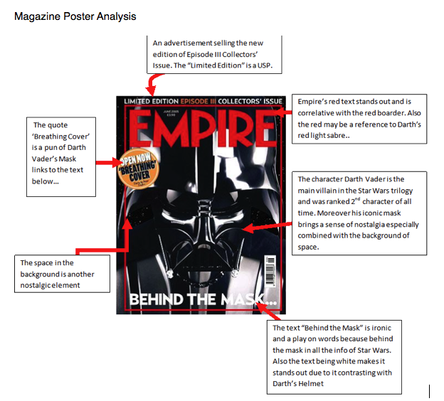
The shine of Darth Vader’s helmet has been airbrushed to seem authentically gleaming, this connotes prestige, his mask seems to aspirational, especially with the title Empire above it which relates to the Star Wars film, The Empire Strikes Back. Underneath Darth Vader’s breathing apparatus is the anchoring text “Behind The Mask...” this is to reference to the behind the scene reviews within the magazine. The connotations of space is nostalgic of the Star Wars series, moreover the similar colors of space and Darth Vader’s make him seen somewhat omniscient and infinite.

Additionally both the cover mounts relate to Darth Vader’s helmet, ‘Breathing Cover” suggest that the front cover could be used, moreover “Behind The Mask” is another cover-mount. Although the font is not particularly distinct as it uses an ariel text; however the title “Empire” is in red which stands out and denotes a contrast to the black of Darth Vader’s helmet, furthermore the connotations of red suggests blood, anger and war all things which run closely with Star Wars’ plot. Also the white of the “Behind the Mask” contrast with Darth’s Vader’s attire, this was probably used to stand out as it is ambiguous more-so because of the ellipsis. Lastly the orange background of the ‘Breathing Cover’ makes it distinct as it is an obvious advert and links to the subtitle above which explains what the Star Wars article and explains that it is limited addition. 

The term “Behind the Mask” suggests that characters can find out more of the mysterious Darth Vader or those who have not seen the film before may want to understand his origins and where he came from. Furthermore the graphics used on Darth Vader make him seem defined within the unknown of space, this is due to the layout which makes him take up at least 90% of the page. The titles and subtitles are belittled by the ever present Darth Vader, this makes it obvious that he is the major attraction of not only the Empire front cover but also the Star Wars series. Although the title “Empire” is the biggest text on the page and its red makes it stand out against the backdrop of Darth Vader, who is the main image of the front cover but also defines the text above which means they are coherent.

The lack of words is similar to Darth Vader as a character more so because the words have a stronger affect because of the lack of text. Being synonymous as a marketing tool is cunning and leaves the audience wanting more, although the puff does contrast all on the page it is lacking compared to other advert clustered Empire front pages such as Hannibal issue. The Unique Selling Point of the magazine is not the text but rather Darth Vader, his presence makes it clear that the magazine will be about Star Wars and the characters within moreover the added bonus of a limited edition makes it more accessible and attractive, this is known as a Skyline. The strap-line is unusually at the bottom of the page and it is used to make the reader more interested, “Behind the Mask” is ambiguous in perspectives such as the character, the series and the magazine and the ellipsis makes this more obvious. 

Friday 26 November 2010

Red Dead Retribution Poster Analysis

When we were thinking of a name for the film, we wanted to find a name that can represent the story line and the tag line of the film in just one word. A short summary of the film is that killer is getting pay – back for what the bullies put him through. So with that information we were thinking of calling the film ‘pay-back’, however this was too Cliche and we felt that it wouldn’t attract viewers to gain interest in the film if there saw that title. So we looked at different words that has the same meaning of ‘pay – back’ and then Robert pitched the name ‘Retribution’, which means a punishment that is considered to be morally right and fully deserved. We went with Retribution as it representation the story-line perfectly. From our research, we notice that the title of the film is one of the key selling points in attracting people to watch the film and we need to let the audience know that this film is a thriller just by looking at the title. With that in mind, Muyiwa was enthusiastic in calling the film ‘Red Dead Retribution’ as both ‘Red’ and ‘Dead’ are key conventions to a thriller film and this will automatically alert the audience that this is a thriller that will involve bloody, nasty revenge. 

The Title ‘Red Dead redemption’ has a lot of significance towards the synopsis of the film, so we illustrated the title in large font to make it distinctive towards the viewers. We added our own effect towards the font in order to make it creative. At the end of each letter of the title we created an effect where the edge looks sharp which illustrates that the film will involve sharp objects such as Knives, axes and other sharp props. This will explain to the audience that this film will have a lot of gore and bloody scene as the anti – hero will be occupied with sharp objects. However, the effect that we used for the Title can be interpreted another way as being a fade which represent a ghost that can be contrasted to the anti – hero.

The tag-line to this poster is ‘your Reap what you Sow’. The reason why we used this tag line is because it is a biblical reference which relates to the synopsis of the trailer. Having this tag-line is a quick way to gives a strong idea to the audience about what the film is about. By laying out the tag-line in this unique and creative way, we are creating a sense of suspense. Most film poster has their tag – line is one line or in one font, however in order to make the poster stand out, we separated the tag – line to emphasis the point.

As we analyze different film poster, we recognized that the main character is usually the main, middle figure in the poster. As we acknowledged that, we decided to put the main character to our film, the anti – hero, as the main, middle figure In our film poster, in order to We have the killer holding the college in his hands to show that he will have full control over the events of this college and also gives the idea to the audience of where the film will mostly take place. The blood on his hands indicates that he will be doing a lot of violence during the film which will be bloody. Also, since blood is one of the main conventions of a thriller film we thought it will be ideal to show this in the film poster and this is why we used dark red font because the colour symbolizes blood.

To make this film poster unique we decided to have shots of the victims in the film and use that as the poster’s background. We used six screen shots and use the negative effect in order to make it effective. This effect is similar to a camera flash which is known to be quick and what we are trying to illustrate to the viewers is that when the anti - hero strikes it will be fast. This gives an idea to viewers that the film’s tempo itself is at a fast pace which will attract people who enjoy fast paced thriller films such as ‘SAW’ or ‘Paranormal Activity.’ Each of the six pictures has its own story that is explained in the film and for that reason; the audience will be put in suspense as they will want to know the outcome of these characters in the shot. The top left picture is one of the victim’s hands being pressed on the window to portray suffering and this will make the audience curious of why or how this victim is suffering.

The top right picture shows one of the victim’s mouth being cellar taped to indicate that she has been kidnapped. We wanted this to create a sense of claustrophobia as this has been used effectively in other film teaser trailers that we have analyzed. The middle left picture shows one of the victims looking at something in fear which will make the audience seem inquisitive in what the victim is looking out for. The middle right picture is a portrait shot of one of the victims looking petrified and the bottom left picture is another portrait shot of the anti - hero before when he was a college student. The bottom right shot shows one of the victims peeking behind him to see what is happening in the room. With this shot, we wanted to create anxiety towards the audience as they wonder what is in the room.
 
As we analyzed our chosen poster, we noticed the writing below which tells us who are involved in the making of the film. The information that the writing provides includes the film production that made the film, the producers, director and other information. We decide to copy this aspect of the poster as it makes it look professional and shows the audience that this is a real horror film.

Other ways to make this poster look more professional we added the certificate sticker so that the audience will know what the age requirement is. What inspired us to decide what the age certificate will be for our film was the research we gathered. From the pearl and dean website, we found out that the majority of the audience that watch thriller films like ‘SAW’, ‘Paranormal activity’ and clover field are from 15 – 24.

Wednesday 17 November 2010

Research: Poster Analysis of Cloverfield

Click on the image in order to fully maximise it, to view the analysis of the Cloverfield poster.


Monday 15 November 2010

Research: Poster Analysis of Dawn of the Dead


1)    What are the main colours used in the poster and what do they connote?

The only main colours in the poster are white and red. The white background helps emphasize the importance of the title ‘Dawn of the Dead’, due to how the title is red itself, making it clearly stand out to viewers and catch their attention. This is done to help the name of the film stay in the minds of viewers so that they’ll be persuaded to watch the film when it is released. The beige colour of the zombie also stands out in the white background, catching viewer’s attention so that hints of the narrative can be given out on the film, that it’s a zombie horror film.

2)    What symbols are used in the poster? Do you need audience foreknowledge to decode the symbols?

The zombies white pure eyes symbolizes death, due to when someone is dead their eyes become pure white, due to there being no blood running through their eye sockets.   The blood stained clothes and dried blood on the zombie face yet again symbolizes death. The title of the film ‘dawn of the dead’ symbolizes the zombies due to how they’re dead but they’ve risen back to life, linking in with the words of the title of the film ‘dawn’ and ‘death’. After analyzing these codes, I can say that audiences don’t have to have foreknowledge to decode the symbols due to how they’re plain obvious, helping audiences realize the narrative of the film clearer.

3)     Are the messages in the poster primarily visual, verbal, or both?

The messages in the poster are visual and verbal. For the verbal message it uses the title ‘Dawn of the Dead’ which establishes the film being about death, giving more hints to the narrative of the film. For the visual message, the mid camera shot of the zombie with blood on his face represents death and zombies, giving away the message that the narrative of the film is probably based on zombies, linking in with the title of the film.

5)    Who do you think is the intended audience for the poster?

The poster doesn’t give an age certification for how old you have to be to watch the film. Instead, the film shows a zombie with blood all over him suggesting that the film is aimed at older audiences, due to how the use of blood suggests that the film may be gory and violent, making it aimed at older audiences who are 18 and over, female and male.

6)    Given that all movie posters have the same purpose - to get audiences to go see a movie – what persuasive techniques are used by the poster?

The poster doesn’t use a large range of persuasive techniques to entice viewers to watch the film; however, it does use an image of a bloodied zombie to sell audiences the idea that the film is a zombie horror flick. This entices audiences to watch the film, due to how zombie horror films are a very popular and conventional genre which movie goes tend to watch. Another persuasive technique is the use of a slogan which says, ‘When there is no more room in hell, the dead will walk the earth’. This slogan helps showcase the narrative of the film more, revealing the film to be controversial with Christianity, due to how it relates to hell. Apart from theses persuasive techniques, there is a lot the poster is doing to entice viewers to watch the film when it’s released in the cinema.

7)     Is a star used as a USP (unique selling point)?

The poster doesn’t showcase any well known actors in the poster, but mainly focuses on the idea that the film is about zombies. This suggests that the film may have no star power in it but instead well performing actors, to offer realism in the hopes of making the film more believable to audiences so that they’ll watch it. 

8)    Are ‘expert witnesses’ quoted?

There are no quotes from magazines showing what top film reviewers think of the films such as Empire, Sight and Sound, etc. Viewers have to believe that the film is good by looking at what’s being shown in the poster, which in my opinion isn’t a lot.

9)     How is attention gained (humor, shock, surprise)?

The image of the bloodied zombie is the main centre of attraction in the poster which catches the attention of audiences due to how it’s something audiences don’t expect to see in their normal lives. The clothes the zombie is wearing would be associated as common clothes an older male would wear but by the zombie having blood on his face and clothes and having white eyes, his image becomes disorientated and disturbing.

The title of the film is another technique used to gain audience’s attention by standing out from the white background by being red, so that audiences will hopefully remember the name of the film when they go to the cinema. The slogan also catches audiences’ attention by being controversial by mentioning Christianity through talking about hell. This helps reveal more information on the narrative of the film which audiences will be interested in, helping grab their attention.

Sunday 14 November 2010

Research: Poster Analysis of the Hills have Eyes 2


The only main colours in the poster are white and yellow, with the minor use of black. The use of yellow helps create a grainy and gritty color effect which emphasis the location being set in the desert. The only use of white is in the title of the film ‘The Hills Have Eyes 2’, which helps the title standout more in the poster, to capture the attention of viewers, so that they’ll hopefully remember the name of the film when they go to the cinema. The use of black fading around the sides of the poster helps create a claustrophobic feeling, helping create a sense of entrapment, which may link in with the narrative of the film.

The mysterious potential villain blocks out half the sun, leaving the top half of his body covered in shadows. This symbolizes a dark personality, with unclear and dark motives, clearly establishing him as a potential villain. The title of the film symbolizes its location, due to how the ‘Hills’ word, links in with the deserts vast amount of sand hills. The word ‘eyes’ in the title suggests that there’s someone or a group of people spying on victims, linking in with the idea that people are being captured and trapped. 

The villain and victim are the main focus in the poster, due to how there are positioned in the centre to grab audience’s attention, to give more narrative of the film away.

Visual and verbal messages are used throughout the poster, to help give the narrative of the film away to audiences through different forms. The visual messages are the most popular form in the poster such as there being someone in a bag being pulled away by a mysterious figure, suggesting the film to be about abductions and entrapment. Another verbal message is the empty desert landscape, suggesting that victims, who maybe abducted have no chance of escape or help. The only verbal message is the title, which suggests that the film is set in the desert where people are being spied on, probably leading to abduction.

By analyzing the visual messages, it seems that the film may display quiet violent scenes due to how the victim is being dragged on the floor by a mysterious figure. The whole colour scheme of the poster uses a dark yellow pallet, which creates a dark atmosphere full of tension and suspense. It’s due to these two main visual aspects of the poster that I feel it’s intended for 18 years old and older (male and female) because they’ll be the only type of audience that will be legally old enough to probably see all the graphical violent scenes that the film may have to offer.

The poster uses tension a lot by not revealing too much of the narrative away such as the face of the mysterious villain dragging a person in a bag, to help establish who he is and if he’s human or not. The poster relatively leaves audiences with only a few clues to the narrative, never revealing the whole extent of it, persuading audiences to watch the film in order to find answers. Another persuasive technique is that the poster uses the title ‘The Hills have Eyes 2’. By putting 2 in the title, it’s establishing that the film is a sequel to a prequel and so viewers maybe interested in watching the film, due how the first film must have been good enough for there to be a sequel.

Friday 12 November 2010

Audience Feedback on our Teaser Trailer

Here is a short video from two individuals we interviewed to gain their feedback on our opening teaser trailer, which has proved to be positive.

Wednesday 10 November 2010

Official Red Dead Retribution Teaser Trailer

Here is our teaser trailer, finally completed. Double click on the video in order to watch it on YouTube, if you want.